Artwork
"It has been an intention from the beginning to provide this authentic project which is defined by real interactions of human beings with a warm, non-aseptic look. With the Sanpedro360-logo as an initial point, the entire internet presence was outfitted with a robe that matches the sustainability issue by its recycling characteristics and is able to score with simplicity without abstaining from attention to detail.
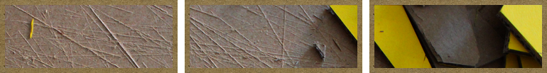
The Sanpedro360 overall main symbol itself is a result of intensive work with recycled cardboard. Even if only pixels remain after it has been digitally photographed, this analogical method of operating as a first step provides the advantage, that ideas and details arise which get a very different reference to the issue than working just digitally. With its therefore implicated authenticity, the logo is supposed to display the very essence of the Sanpedro360 approach.
The geometry of the logo unites the stylized volcano Licancabur, a cloudless blue sky and a yellow arrow that represents at the same time the sun, the recycling approach and a global and therefore cycle thinking. Due to this design, the logo is supposed to point to the place of the origin of the Sanpedro360 approach (by the volacano Licancabur that represents SPDA) with a simultaneous reference to the unlimited and integrating character of our idea (by the encompassingg arrow). While the classic recycling arrow is painted green and points counterclockwise, the Sanpedro360 arrow turns forward and glows in a positive yellow color - Sustainable into the future!"
by Daniel Urban (developer and designer of the website)